Select a category
Brands to Watch
How Healthy Fast Casual Brands Are Visualizing Their Value(s)
How Healthy Fast Casual Brands Are Visualizing Their Value(s)
by Emma Levin
SHARE
A look into five brands whose design-savvy visual identity communicates their commitment to healthy fast food.
When you imagine fast food, burgers, milkshakes, or anything deep-fried may be the first images to come to mind. Colorful salad concoctions, freshly pressed juice, and vegan-chicken burgers, on the other hand, might be the last thing you think about.
Many fast-casual brands are orchestrating marketing campaigns to prove that fast food can be healthy, delicious, and visually engaging.
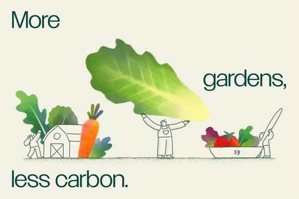
These eateries are using focused imagery and branding to show fast food as accessible, healthy, and cool. Sweetgreen, for example, takes the nostalgic approach by using old-fashioned cookbooks to conjure up positive food memories.
Meanwhile, LYFE Kitchen emphasizes comradery with their Chicago neighborhoods, showing their commitment to the local community. For the newly branded Beatnic, their team leans into the wacky and unconventional to electrify their customer base.
Keep reading to learn how these fast-casual brands are visualizing their value and marketing a new era of fast food.

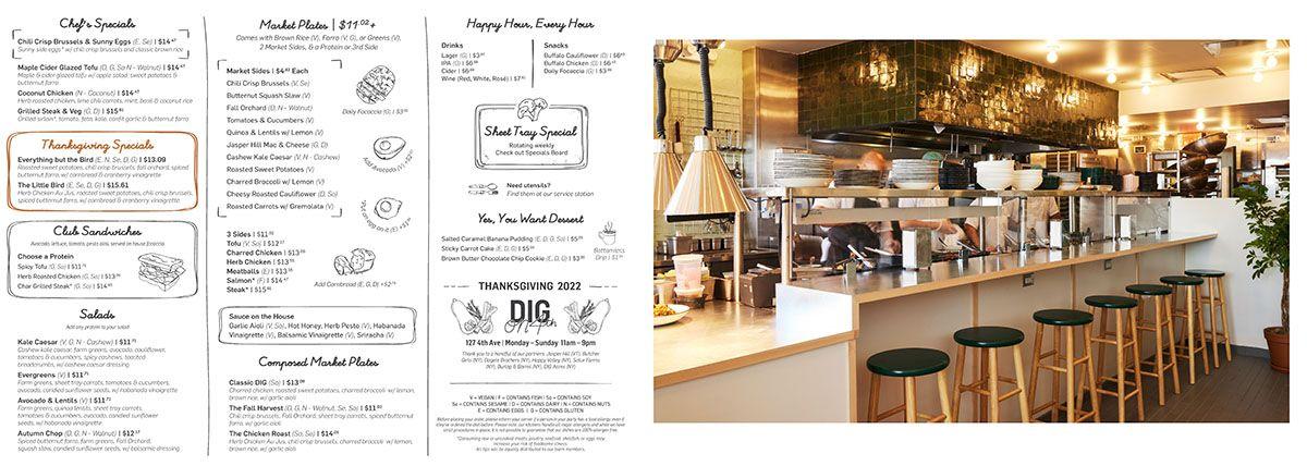
▲ Image via DIG
Formally known as DIG Inn, now simply DIG, this fast-casual eatery also embarked on a rebranding following the losses caused by the pandemic. The company dug its heels deeper into its mission of sustainability, accessibility, and serving up good food.
Dig takes a fresh, crisp, and accessibly minimal approach across its entire visual identity. DIG presents colorful warm photographs to contrast the black-and-white typography across their menu and website.
Everything is clear and easy to read, and the food pops out of the photographs as if they’re being served on a silver platter. The black and white illustrations throughout their website and menu appear as if a guest etched them on a napkin while sitting at a DIG countertop.
The fast-casual brand also has a progressive commitment to workplace equality. The founders intend to offer a four-day workweek to hourly employees. “It became super clear that if we didn't [offer customized options], we were gonna end up pushing women of childbearing age, in particular, brown and Black women, out of the company, and that was not going to fly,” DIG’s VP of People, and Culture Melinda Sharretts told Fortune.
DIG stays on top of the trends to keep its values high and visuals fresh, appealing to health-conscious customers.

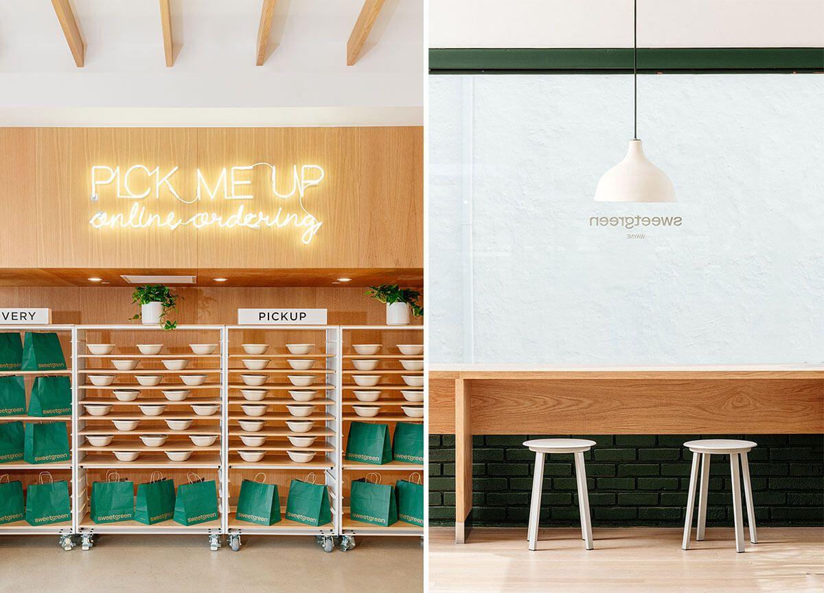
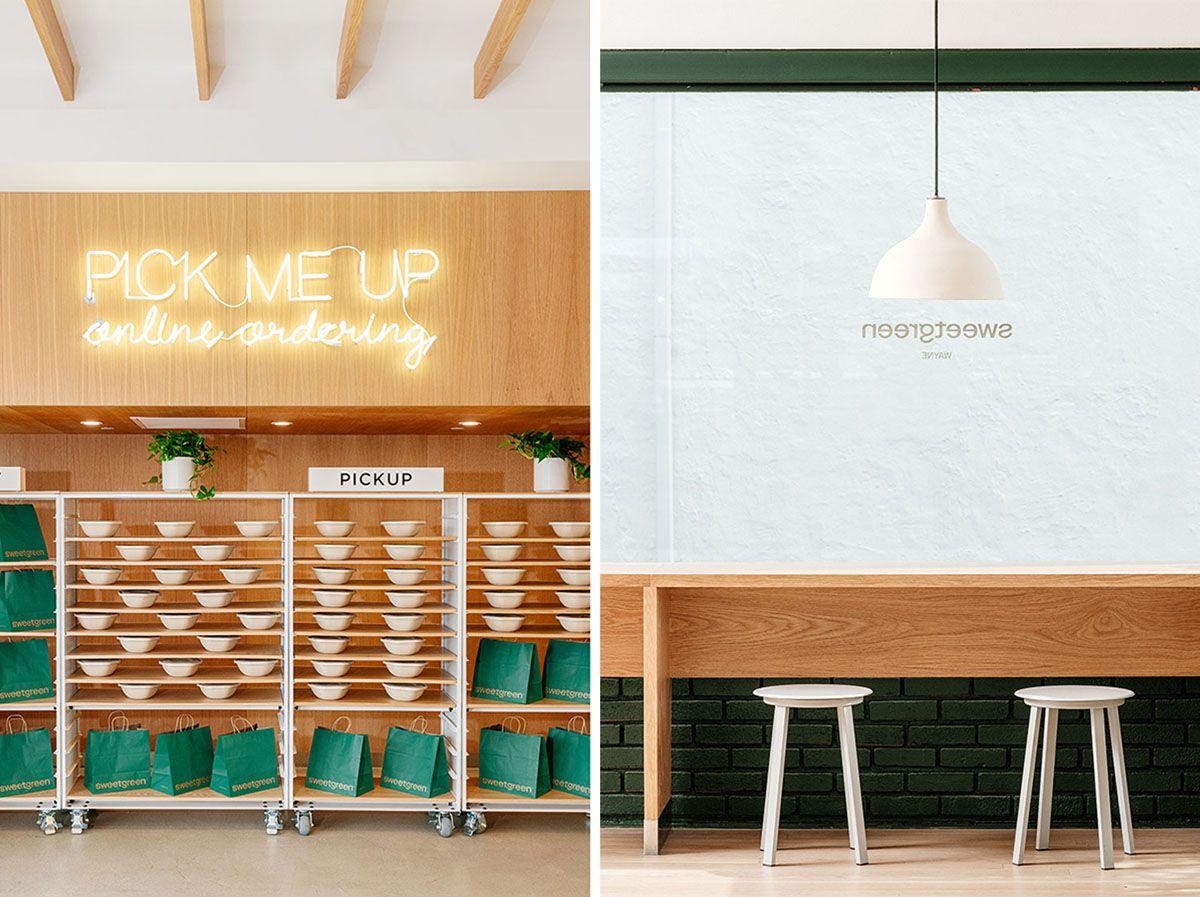
▲ © Katelyn Perry/ The Luupe for Sweetgreen
Sweetgreen underwent a redesign in 2021, balancing nostalgia, humor, and even surrealistic imagery with its clean, sometimes minimal store aesthetic.
Their new website is lighthearted, vivid, and meant to honor chefs of the past. Sweetgreen took inspiration from vintage cookbooks and gardening publications for their new facelift. Their imagery shows the simple pleasures in the cooking process, demonstrating that although cooking is messy and imperfect, it’s also fun.

Sweetgreen's rebranding even won Fast Company’s 2022 Innovation by Design Award for Branding. Sanuk Kim, who helped with the rebranding on the Collins team, said, “By infusing a touch of surrealism with our larger-than-life ingredients, we were able to keep the style light and playful while also amplifying Sweetgreen’s ethos of scratch cooking,” as reported by It’s Nice That.
Over the past year, The Luupe also collaborated with Sweetgreen, photographing their stores, staff, and culture as new locations open throughout the United States.
Sweetgreen’s branding enforces its belief that everyone deserves access to good, healthy food. The company even shares its recipes on social media, showing full transparency with its costumes. Sweetgreen’s visuals leave you with the thought that eating healthy is not only easy, but it’s also delicious.

▲ Image via LYFE Kitchen
LYFE Kitchen, an acronym for “Love Your Food Every Day,” takes a different approach than other large fast-casual restaurants. LYFE decided to focus on one city to distinguish itself as a friend to Chicago communities.
LYFE was sold to L3 Hospitality Group in 2018 when the company focused solely on its only franchisees, the Chicago stores. This specialized approach allows LYFE to bring its community to the forefront of its branding, showing that its customers and community come first.
Emily Paulsen, the Director of Marketing, spoke to QSR Magazine shortly after this rebranding. “We’re really trying to make all of our upgrades not only aesthetically pleasing but have them really make sense for the guests and just enhance the experience at each individual restaurant.”
No longer under the thumb of corporate, the Chicago stores could rightly establish themselves as local Chicago businesses. They had the capacity to improve their website, menu, and online ordering with a fresh color scheme and one that’s playful and current to the time.
By forgoing corporate uniformity, LYFE now has the flexibility to tailor each location to its surrounding neighborhood. They can also change their website depending on the seasonal and latest menu offerings. LYFE shows they’re not a neighborhood disruptor or a gentrifier but rather an establishment that’s right at home.

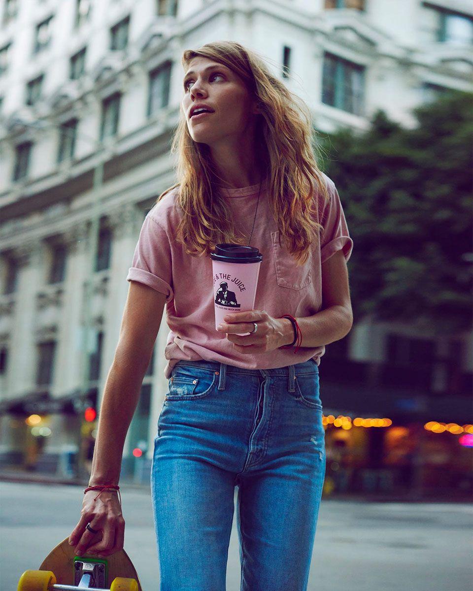
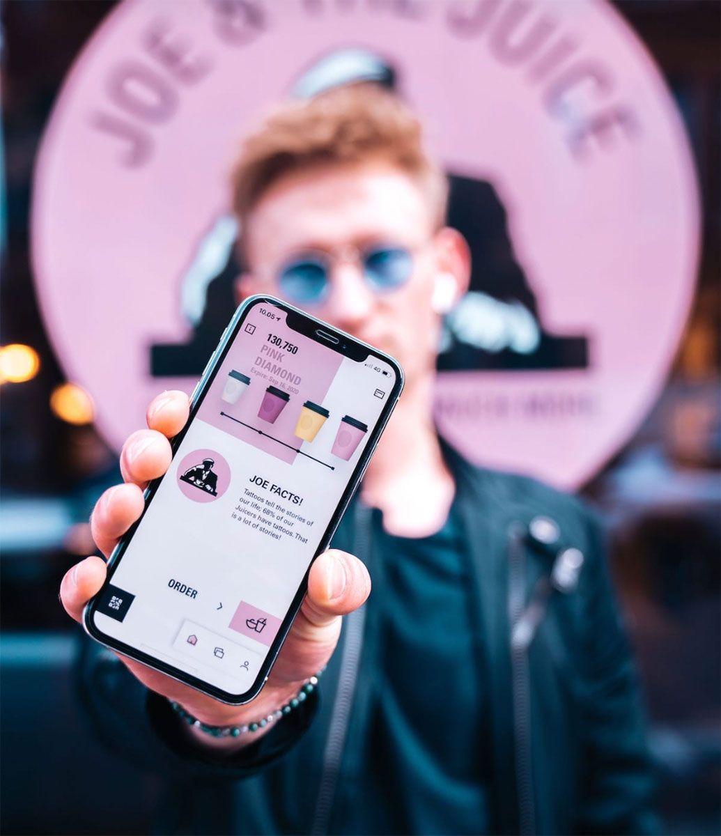
▲ Photo via Joe and the Juice
During a time when it’s hard to distinguish between the hundreds of coffee brands and stores popping up every day, Joe & The Juice’s visual identity is bold, young, and strictly rock-n-roll. Joe & The Juice began back in 2002 from the mind of Karate-champion Kaspar Basse. Now with over 300 locations in 16 countries, the coffee/juice company remains on the pulse, even 20 years later.
Joe & The Juice aims to inspire their guests to lead a healthier lifestyle, one that is fun, meaningful, and cool. Their branding is loud and direct, from their stores to their website and rewards app. With tons of pink, bright pastels, and Miami-hued photography, they’re resonating with millennials and Gen Z.

▲ Photo via Joe & the Juice
Their imagery includes photos of tattooed team members, skaters, proof of sustainable farming, and lots and lots of pink. They invite their customers to “hang out with the cool kids” and become store regulars. Their app even has a rewards system for customers visiting stores in multiple countries, appealing to everyday adventurers and the travel-obsessed.

▲ Gif via Beatnic
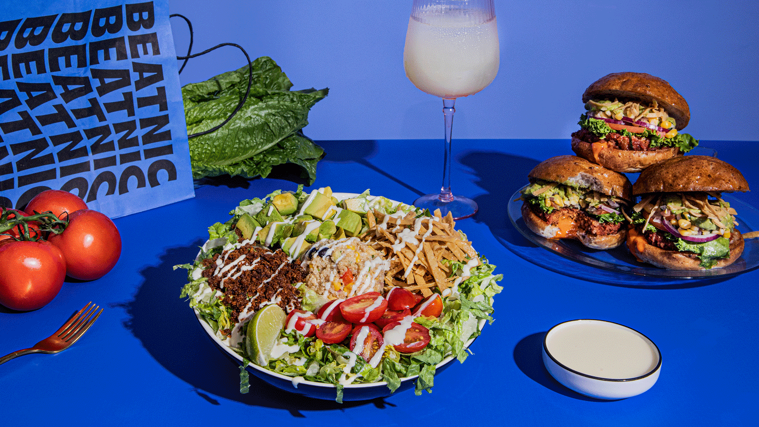
Formerly “by Chloe,” this entirely vegan eatery recently rebranded from under the helm of a celebrity chef to the bolder, louder, and more eccentric Beatnic. The restaurant’s name is a nod to the 50/60s Beat poets and artists like Allen Ginsburg and Diane diPrima who boldly rejected society’s conventional norms. The chain’s flagship store is located in New York City’s West Village, a major hangout for the original Beatniks.
Beatnic’s current imagery and visuals are outlandish and in your face. Their food appears larger than life in their photographs and animate GIFs, highlighting messy sauces dripping from their vegan burgers. Framed in front of colorful backgrounds, the result is a brand that’s expressive, bright, and whimsical.
Humor runs deep in Beatnic’s brand, as seen in this ad that resembles an old-school, late-night infomercial. Of course, Beatnic plays with their audience, subverting norms in a way that’s both charismatic and delicious.
Beatnic’s bold visual identity runs across its entire branding, from its photography to its color palette. The lettering even feels a bit retro with a pop vibe. It shows that a vegan diet and brand can be exciting, weird, fun, and free-spirited.
The brand says it best, “We serve big flavors, vibrant colors, and plenty of personality.”
A Fresher Approach
Each of these brands doubles down on its commitment to sustainability, workplace equality, and food accessibility to reenergize its customer base. By using a variety of designs, illustrations, and photography to refine their brand’s identity, these fast-casual eateries are ushering in a fast-food renaissance. So now, when choosing where to eat for dinner, remember that vegetables are part of the “cool food group” and are not only good for you but also delicious!
ABOUT THE AUTHOR
Emma Levin
Emma is a freelance content writer living a nomadic life. She writes about meditation, travelling, and the upsides of freelance. In her spare time, she's either chugging coffee or falling off her skateboard.