Select a category
Business
The Luupe's New Look: The Story Behind Our Brand Refresh
The Luupe's New Look: The Story Behind Our Brand Refresh
by The Luupe
SHARE
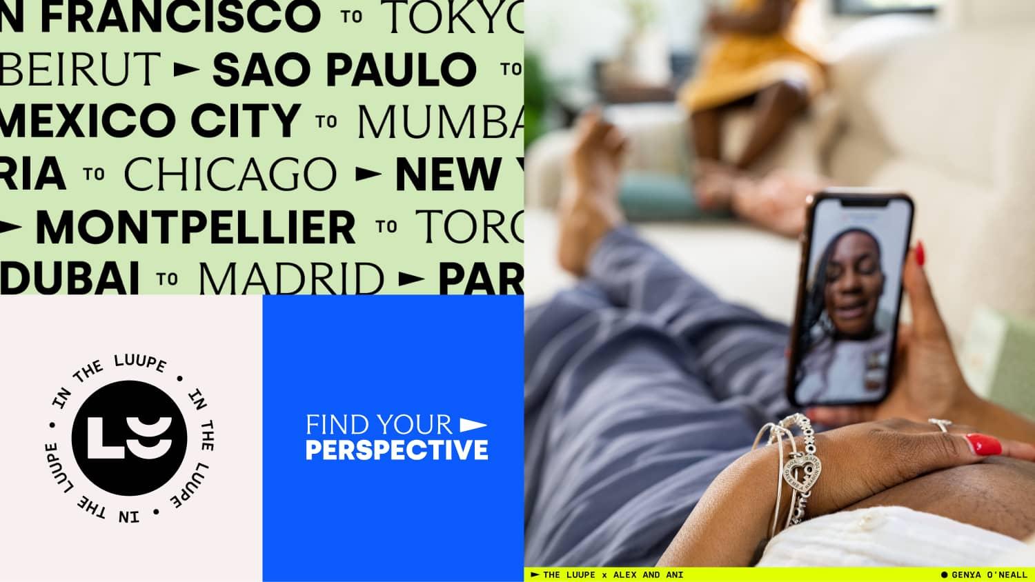
The Luupe reveals new visual identity, capturing the future of content.
We launched The Luupe in 2019 with one goal in mind: help underrepresented photographers connect with brands.
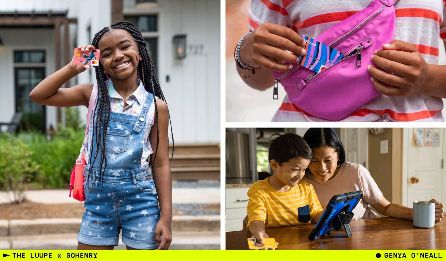
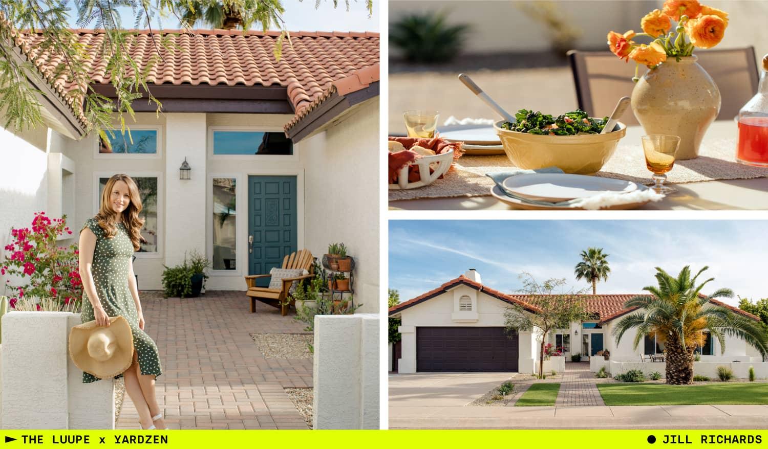
Since then, our community has grown to hundreds of diverse photographers in 50 countries working with brands like Alex and Ani, GoHenry, Peloton, and Sweetgreen.
Today, we’re a one-stop production platform designed to connect brands with professional women and non-binary photographers across the globe. We help them collaborate seamlessly to make great work that resonates with customers everywhere.
We’re reinventing how brands and photographers produce content, from idea to full-fledged campaign. By simplifying how brands source photographers beyond their local networks, we’ve made it possible to quickly get authentic global content at scale. And our production tools take the guesswork out of project workflow and logistics. To continue to build on this mission, we needed an expanded visual identity that would reflect who we are and carry us into the future. way.
We worked with the incredible team at The Working Assembly to create a new logo, color scheme and font portfolio that amplifies our expanded offerings and honors our mission to champion diverse perspectives.
Here’s how we did it:
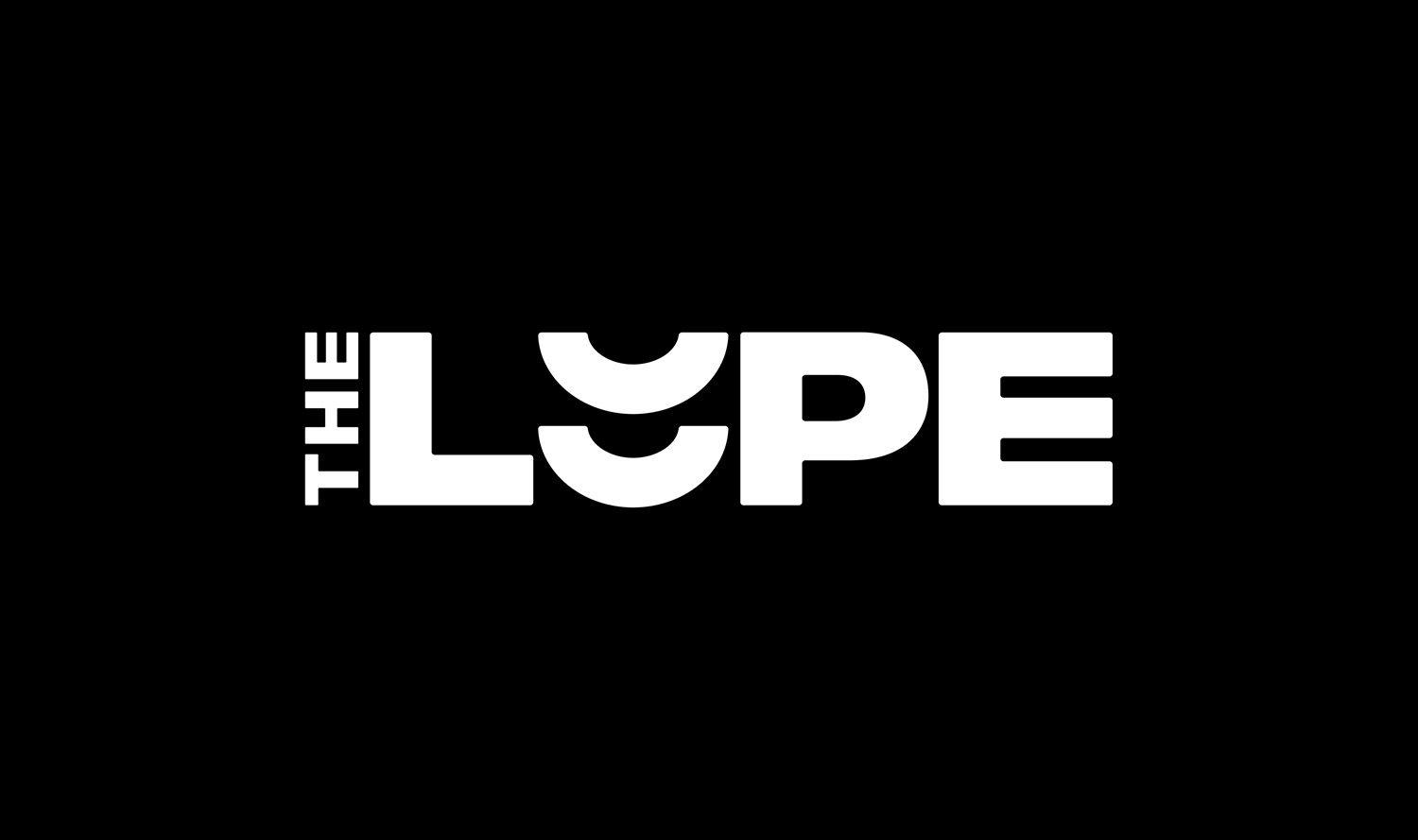
Reimagining Our Logo
Our new logo is the single most visible representation of our brand. It’s bold and has a new presence that leans heavier into the commercial work we produce. It’s strong and confident.
"The stacked double-U shows our support for our community of brands and photographers," says Keren Sachs, Founder and CEO of The Luupe. "It's an homage to collaboration and lifting each other up."
The Power of Color

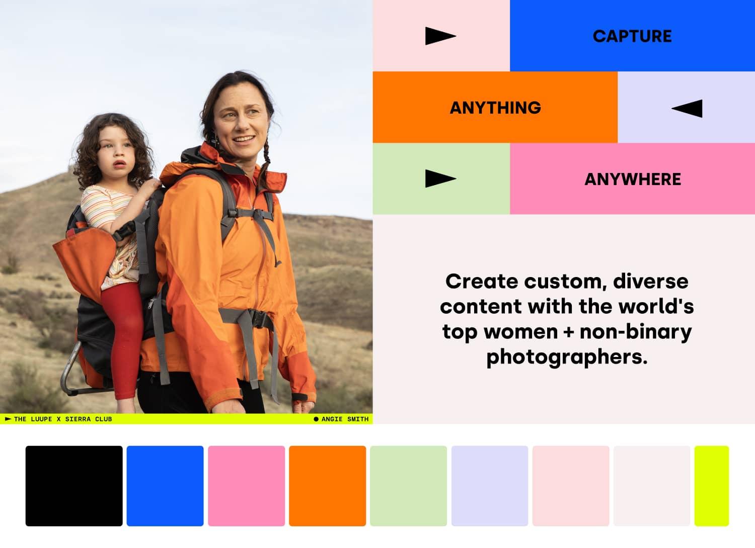
We expanded to a wide color palette that reflects the bold and nuanced possibilities of gender. Our new colors have a fun and fresh vibe that stand out but also play well together in multiple combinations.
Communication Through Typeface

We’ve built a portfolio of fonts that stick out yet stay subtly modern. They reflect the expanding possibilities we can offer brands and photographers. Side by side, our fonts are varied, beautiful and chic. They represent the importance of diversity and strength in collaboration. We’ve also added in a monotype that nods to our photography and film strip roots without being too literally “photographic.”
Fun Fact
“The Luupe” is a nod to the simple, device used to see and magnify small details more closely. It was most commonly used in photography’s pre-digital days when printing in a darkroom – to ensure an image was in focus on the paper. For us, it’s a tool to bring the world in focus and magnify its most important creative voices.
Into The Future
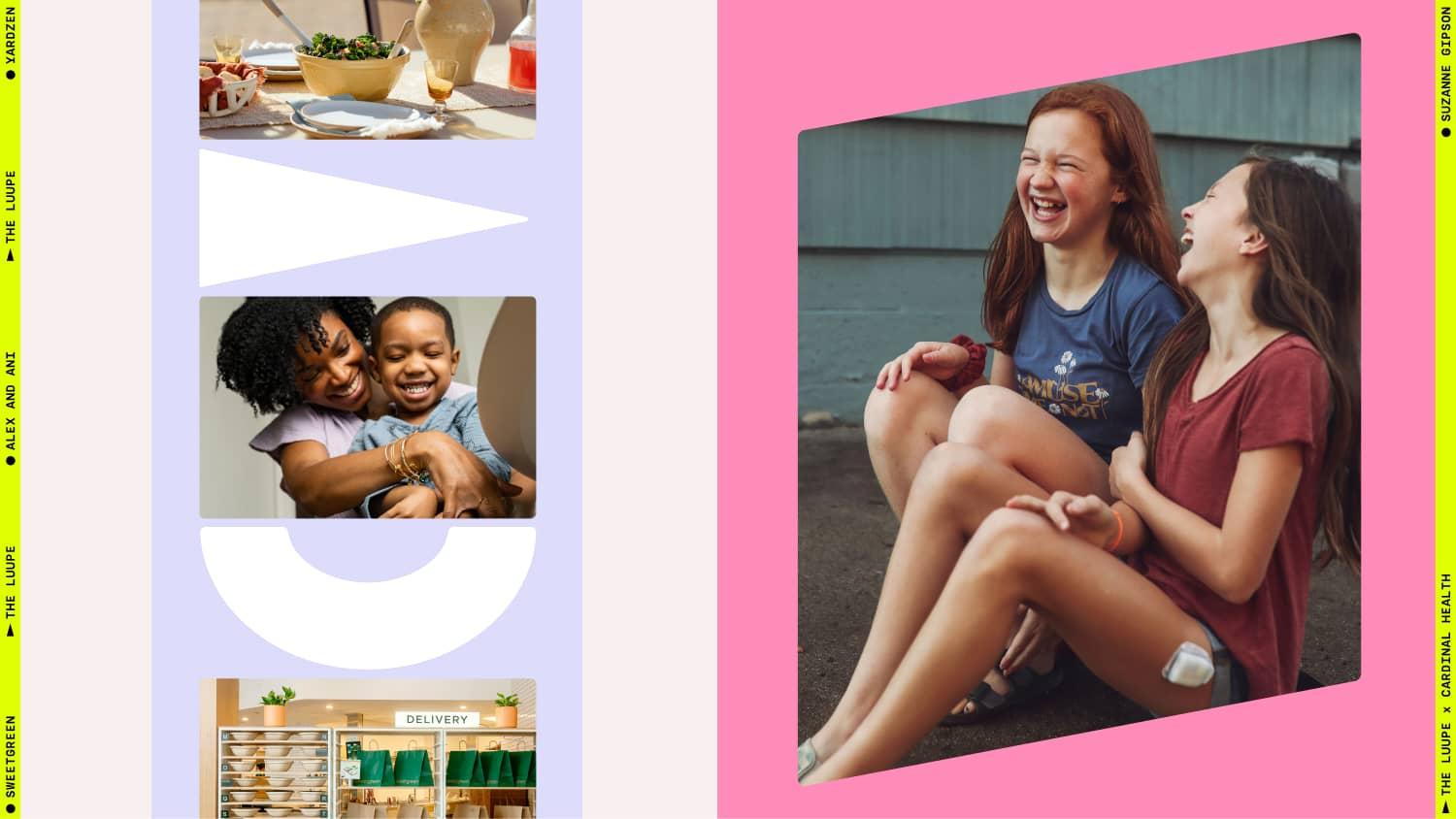
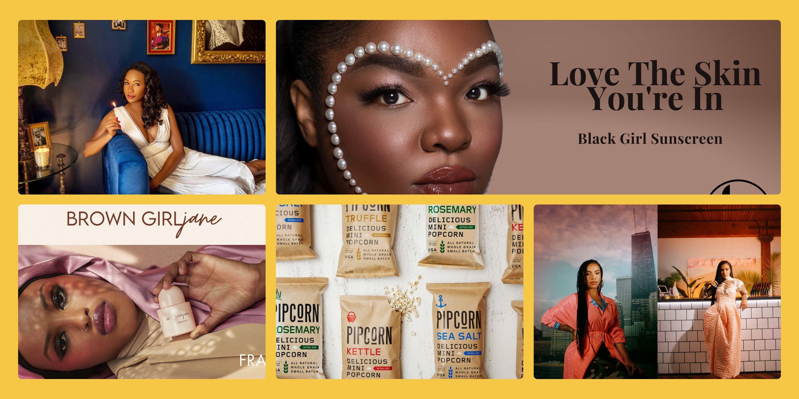
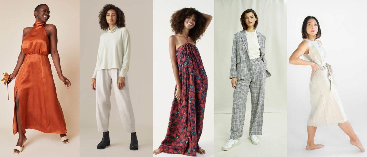
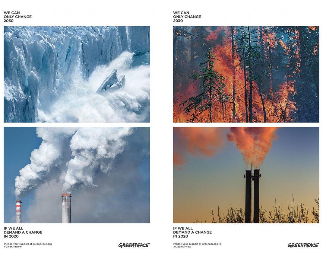
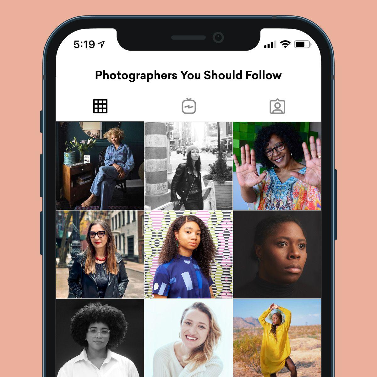
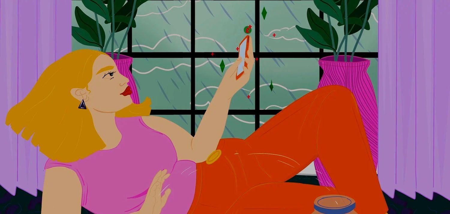
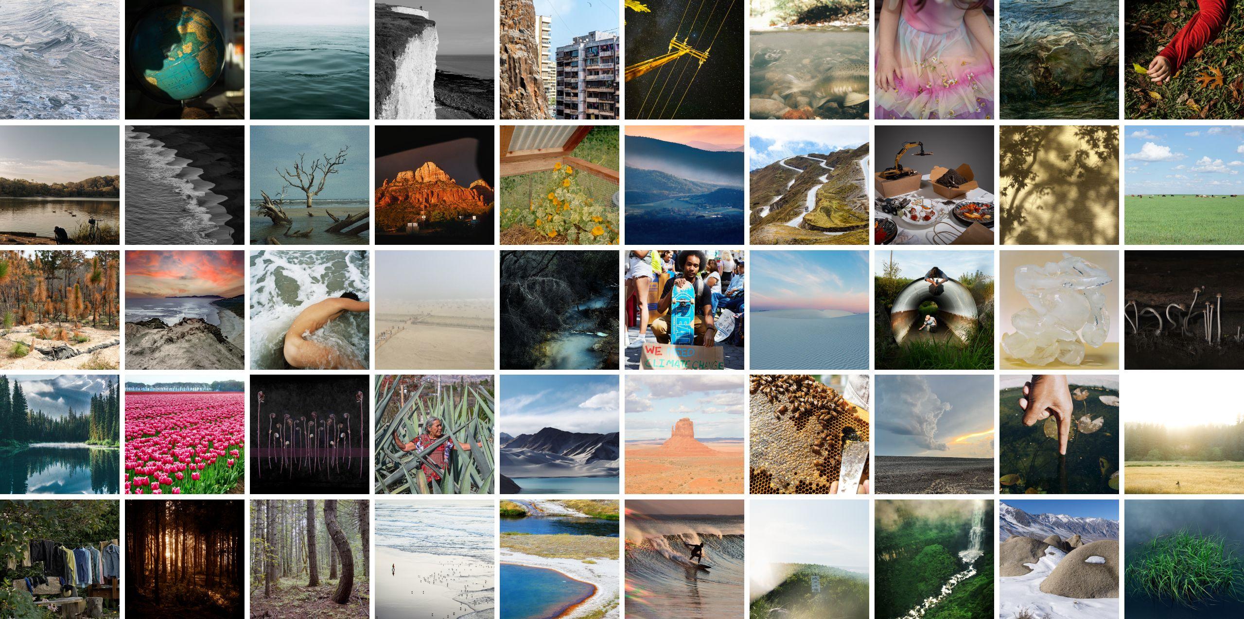
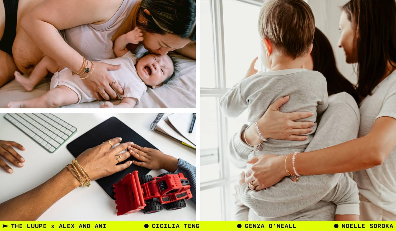
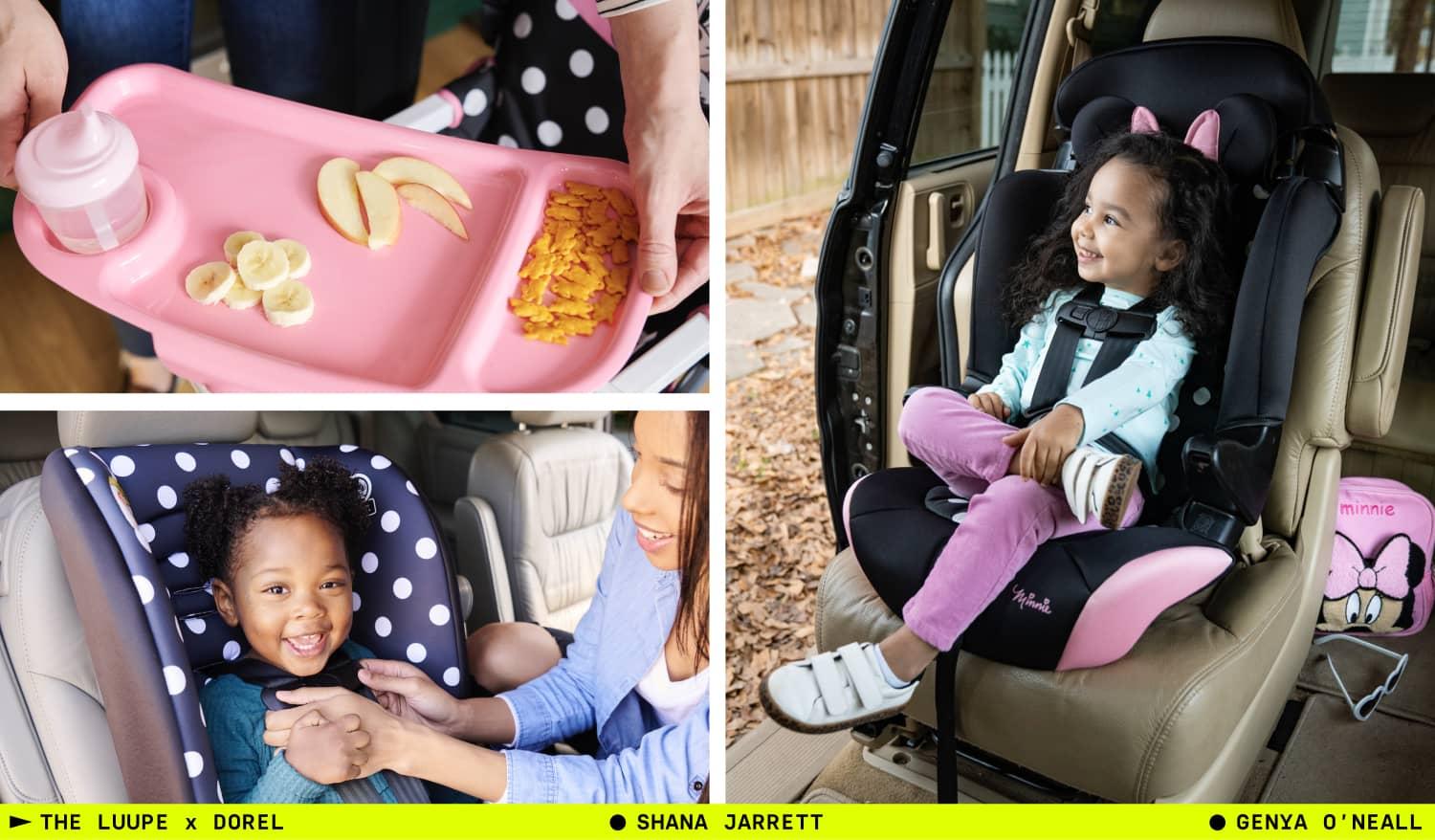
Our new branding celebrates the vibrancy of our community and the feeling of creating beautiful content for the world’s leading brands. Enjoy this tour through some of the imagery and creators we're showcasing as part of our brand refresh.

ABOUT THE AUTHOR
The Luupe
The Luupe is a global marketplace for exceptional visual storytelling.
We are home to a community of professional photographers, directors, and creators with deep experience crafting visuals that resonate and cut through the noise.
In a time where visuals are increasingly machine-made, we're on a mission to keep human creativity at the heart of brand storytelling. That's why we built a platform where real stories thrive, powered by real creators who bring genuine perspective and emotion to every frame.