Select a category
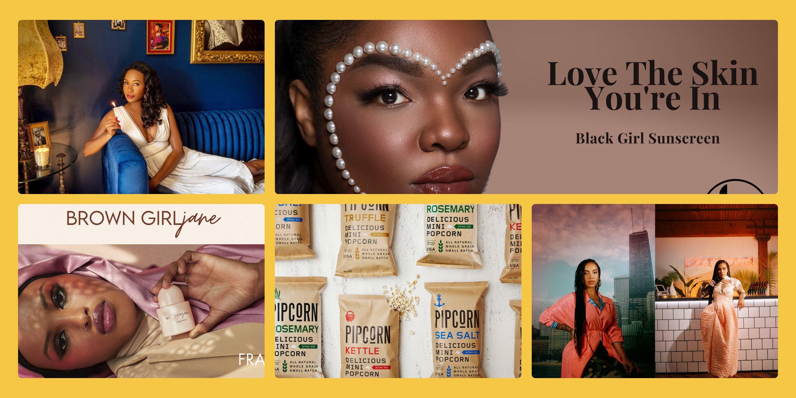
Brands to Watch
Five Brands Doing a Great Job Designing UX for a Broad Range of Disabilities
Five Brands Doing a Great Job Designing UX for a Broad Range of Disabilities
by Rosemary Richings
SHARE
From neurodiversity-conscious navigational tools to blind and hearing-impaired UX adjustments, brands are making their technology more accessible to an often-overlooked customer base. Rosemary Richings offers some perspective.
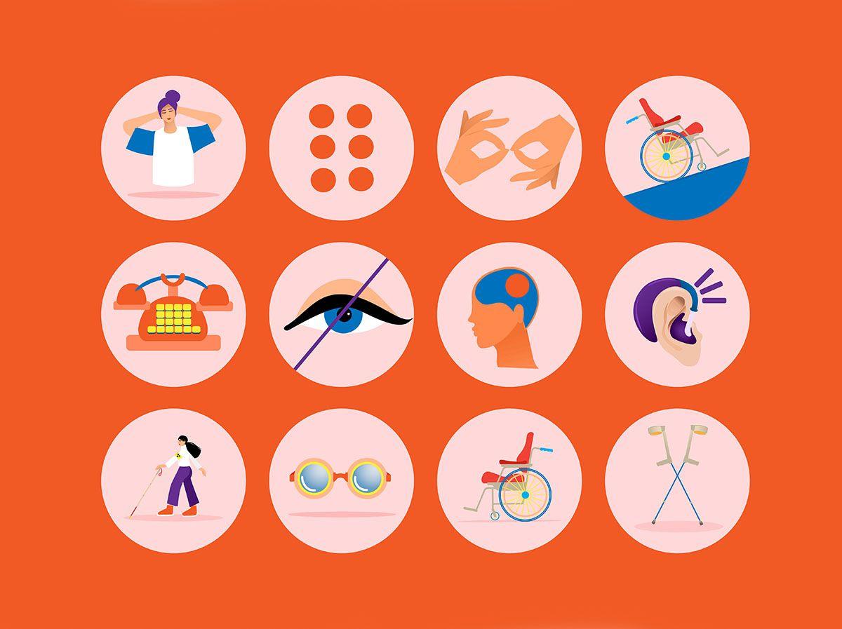
A universal symbol for disability is a stick figure in a wheelchair. It is also the most immediate go-to in conversations about accessibility. This can mislead conversations into a limited focus on physical disabilities. Installing an accessible entrance at work is great, but just one small step to fixing a much wider problem.
For brands - specifically in the context of website accessibility, this can alienate a wide range of potential customers whose obstacles aren’t always physical or visible on the surface. This includes visual and hearing impairments and cognitive disabilities that can be great obstacles to UX if brands don’t keep them in mind.
According to a recent study, 59.1% of people in the US with disabilities have home internet access, and 72% own a smartphone, so this is a huge population for any brand to overlook. Today, 97% of the world’s leading websites do not offer greater accessibility.
Most importantly, how websites and apps communicate essential information matters.
To help you avoid that problem, here are five companies doing a great job at making design and user experience widely accessible. Many of these brands have helped me with my own disabilities - read on and I’ll show you how.
A large part of IBM’s accessibility strengths is just how much its IBM equal access toolkit applies accessibility in the context of what makes the most sense to professional designers:

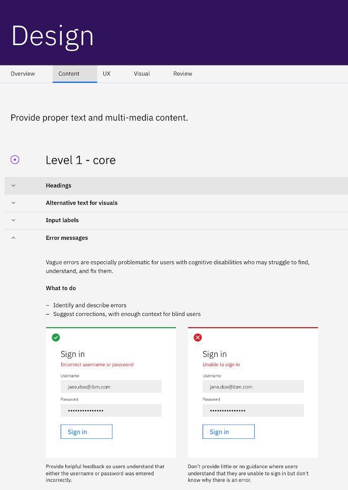
Rather than using the technical language of accessibility, the toolkit discloses what designers need to do to factor in disabled people’s needs and interests in simple, jargon-free English. This helps work around the barrier many organizations face of having individuals trained to design websites, software, or hardware without experience working with disabled people.
A quick readthrough of IBM’s accessibility policies reveals that the company factors in an assortment of disabled users. This includes more obvious details like color and contrast as well as deeper details. On the IBM blog, here’s what UX designer Alexandra Grossi had to say about the company’s typical approach:
“Color and contrast are important, but these do not cover everything in designing for accessibility. Designers must consider all the ways users operate. Such as non-visual elements are too often neglected and left to chance.
One example is non-visible text read by assistive technology that blind or visually impaired users need to be able to utilize a website or program. When this is overlooked, keyboard navigation is less accessible. Design teams must consider how users who don’t use a mouse can navigate their spaces.”

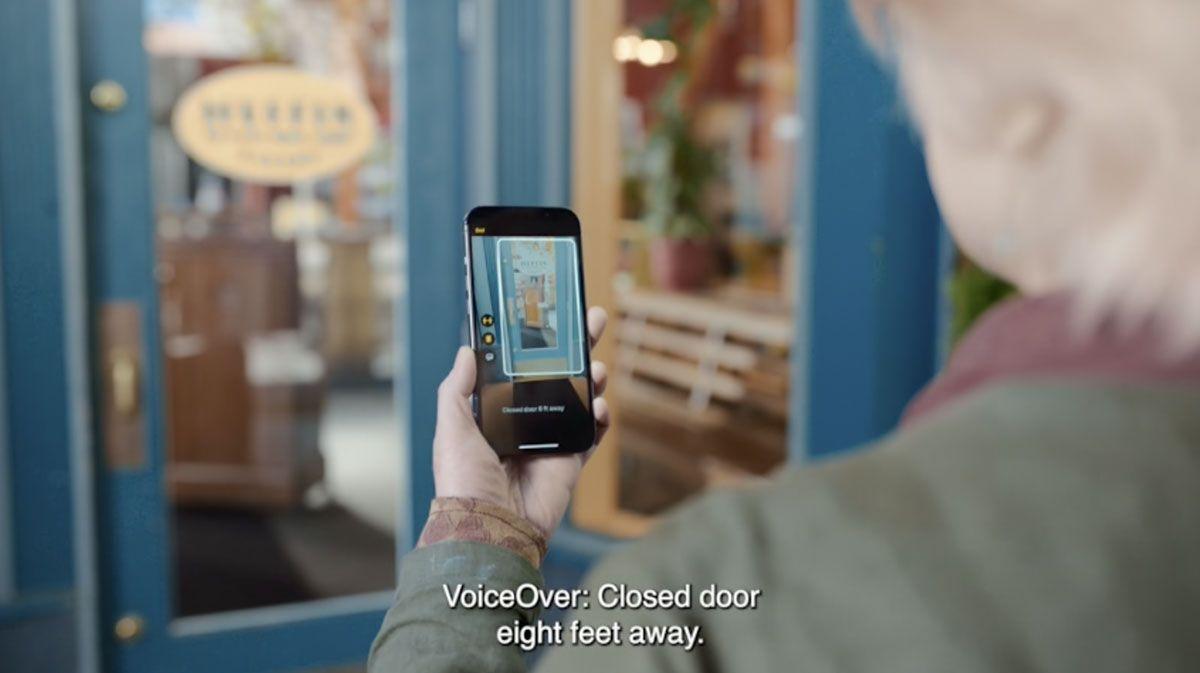
▲ Door detection Image via Apple
One accessibility feature worth talking about is the Door detection and magnifier feature. Apple Maps are great at being a patient navigator. I always loved that it was always there as an assistive tool. Because of my disability, I have always been unable to judge how far away a specific street is from another. I also am prone to get lost in even the most familiar locations. Reading a paper map never works.
My brain can't translate the illustrations on a map to understand where I am going. For example, I often mix concepts like North and South and left and right. Apple Maps shows me where I am with a tiny blue dot. It also reminds me where I am going until something clicks, and I go the right way. Having access to that technology has been a life-changing experience for me. It has made exploring new places less intimidating.
The only flaw is that once you arrive at your destination, you get no help. The application says that your destination is on your right or left, and that’s it. This is a key flaw not only for me but for anyone that relies on the maps feature for navigation.
That’s where the door detection and magnifier feature is so helpful.
With this tool, your phone detects and describes your surroundings. Let’s use this image Luupe photographer Shelby Cooper recently shot for Sweetgreen, for example:


▲ Shelby Cooper/ The Luupe for Sweetgreen
Pretend you’re trying to find it on a map. The magnifier tool will tell you what signs are on a door and in the window. You can get more detailed instructions on the door’s attributes, including how to open it. The door detection and magnifier tool will also tell you how far away you are from the door and the woman in the shop. For those that are blind, you can also turn on speech feedback to dictate all features of the shop itself back to you.
Customer service interactions can be overwhelming and frustrating for disabled people. The instructions are rarely easy to understand. Your most comfortable way of communicating what you need is often not available. And time limits can make you feel like a game show contestant, having to devise your best answer on a strict time limit. It doesn't have to be that way because customer support often requires patience and time.
To help solve this, Zendesk integrated Mailchimp into its customer service chat lines:

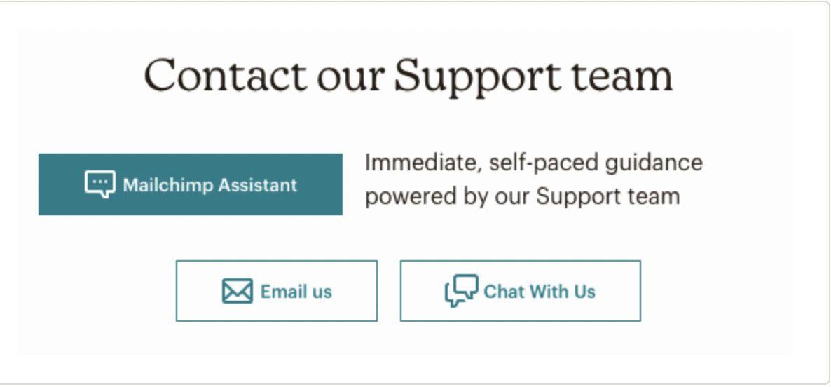
▲ Zendesk's Mailchimp customer service integration
Language like self-paced and support teams is much more than words on a screen. It is a comforting gesture that makes you more approachable to disabled consumers. Customer service reps are often following a script under pressure. Taking that approach doesn't leave room for patience or individualized approaches to communication.
Another practical design choice is the minimalist color scheme of white, black, and blue. It also helps that there are a limited number of options. The informal, simple language means that you immediately know how you can ask for help. Everyone's communication preferences vary. So having both email and phone customer service options make a huge difference.
I learned a lot about Twitter and accessibility through Dr Amy Kavanaugh and That Blind Lads Media.
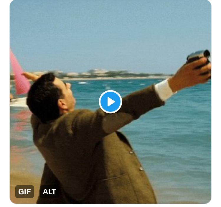
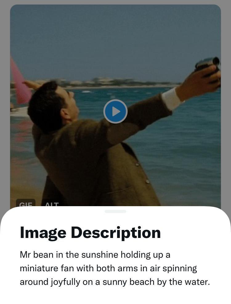
When image descriptions aren't available, context isn't available. That can be very isolating for blind people in any environment. Twitter makes image descriptions easy to view and program. The ALT text of Twitter is the most straightforward interface I have ever seen. For example, when I uploaded this GIF on Twitter of Mr. Bean spinning in circles on the beach, all I had to do was the following:
- Say I wanted to edit the photo before I hit send on the tweet
- Click on add image description in the settings
- Type in my caption
And this ALT box appeared below the image:

When someone clicks on the ALT text box, my caption appears below the image:

Introducing a sensory guide to their Twitter Spaces platform is also a great idea. People with sensory-based conditions can attend Twitter Spaces with far less anxiety. More certainty about an event's sensory features makes a huge difference.
5. Microsoft
I have done some freelance work for a neurodiversity consultancy. My client trains brands on neurodiversity hiring best practices. My freelance work was my first introduction to Microsoft's accessibility efforts. Any way you could think of to turn on a computer, conduct a presentation, or type something on a screen is an option.
- If you need captions, both PowerPoint and Microsoft Stream have captions built into their software.
- If you need to dictate a document or click on something with your eyes, there’s a setting for that.
I talk about the element of flexibility in design a lot in this article, and there’s a reason for that.
Good UX for disabled and non-disabled people is about the flexibility to view instructions in multiple mediums, platforms, and contexts. The reality is that everyone thinks and processes instructions differently. So having the chance to choose between more than one color scheme, font, means of communicating instructions, or page layout allows you to include everyone in your communications.
Although many of the companies mentioned in these articles have massive net worths and teams, you don’t have to have the same resources to take accessibility seriously. All you need is a willingness to learn from disabled users so that you can design interfaces that your customers will be able to access without any difficulty.
ABOUT THE AUTHOR
Rosemary Richings
Rosemary Richings is a Canadian freelance writer, editor, and author living in Marrakech. She has worked with organizations such as Uptimize, The Good Trade, Saatva Mattress Company. Rosemary gravitates toward projects that put her lived experience as a disabled neurodivergent person to work. She was born with dyspraxia, otherwise known as developmental coordination disorder, and was diagnosed when she was 4 years old. Her debut book, Stumbling Through Space and Time: Living Life with Dyspraxia is being released through Jessica Kingsley Publishers on September 21, 2022. Currently, she is serving on the board of trustees of Dyspraxic Me, a peer support group for dyspraxics ages 16-25, and helps organize events for the online global support network she co-founded, Dyspraxic Alliance.